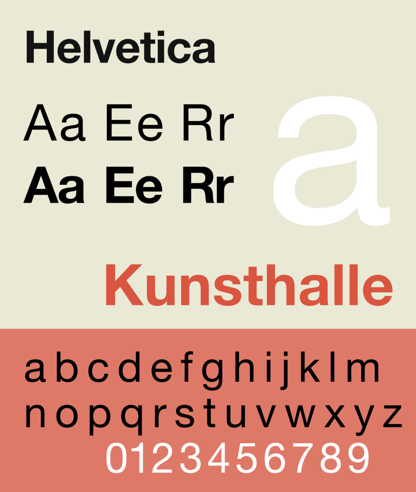
Helvetica

Helvetica.
After finally watching “Helvetica” I found it to be very inspiring and a must watch for UXer’s. I am somewhat surprised that I haven’t watched Helvetica until now coming from a graphic design background. Most designers like Helvetica, LOVE Helvetica, or at least can’t complain about it the way they do for comic sans. It was really interesting to learn about the background and history of this legendary font and all of the culture shift it brought to every day life. To be honest, I didn’t realize how old the font was. It is still widely used today, which is a true testament to its greatness!
I also thought that it was interesting that typography did a loop of trends as we see in a lot of other things in everyday life and culture. Starting with Helvetica, the clean, crisp and straight forward typeface to a period of grunge and disorganization. After the grunge period and introduction of ding bats, you see the pendulum swing back to organized easy to read typefaces. I feel that we are still in this period, especially with people using their phones for everything and having shorter and shorter attention spans due to the overload of information. It will be interesting to see what typography trends we will see in the near future.

